Brand & website · a Zetta Essentials add-on. Zetta Essentials is our managed IT service for Perth small businesses: we run your IT, you run your business. Brand and website work sits alongside it as one of our Design & Web add-ons (this project was our Brand & Website add-on), for businesses and not-for-profits that want their front door to match the care they put into everything else.
This is a not-for-profit website design case study from Perth. A community not-for-profit came to us with a website that was quietly working against them. The one thing visitors came for, what’s on and when, never loaded. Over about eight weeks we took them from a 41/100 site audit to a documented, accessible brand system and a build-ready website design.
The brief: a warm, accessible front door
Before we audited a single page, we agreed what the organisation was trying to be. Then we judged everything against it. The site had two jobs.
1. Help people find what’s on
Someone from the community can find this week’s programs, when they run and how to join.
2. Help people take action
A supporter can become a member, volunteer, sponsor or donor without friction.
There was a third, quieter brief: keep the cultural care. The existing artwork, the Acknowledgement of Country and the notice about images of deceased persons all showed real respect. We kept that identity and made it work harder. As a Reconciliation WA partner with our own Reflect Reconciliation Action Plan, that mattered to us too.
What the website audit found
We ran a full-site audit in July 2026 across all 67 pages. The overall score was 41 out of 100.
The scores were the symptom. These were the causes:
- The events calendar never loaded. The one thing people came to find was missing on every page.
- Body text was 12px. Hard going for older visitors and anyone with low vision.
- The home page never said who they were or what to do next. There was no call to action.
- Accessibility fell short: missing image descriptions, several H1s per page, pinch-zoom blocked, and contrast failures, including white text on a white background.
- It looked dated and felt unsafe: an old, unpatched build, a 2016 footer, and donations only by cheque or printed form.
What we researched
Our research was desk-based, and we were deliberate about what we looked at.
Similar organisations
What works on other community sites, and what gets in the way.
Audience and search intent
What people actually come to the site to do.
Accessibility
Designing for all ages and abilities, including Elders.
Mobile-first UX
Most community visitors arrive on a phone.
Colour meaning
What colours signal, and what suits the organisation’s story.
Cultural protocols
Acknowledgement of Country, the deceased-persons notice and care for Indigenous Cultural and Intellectual Property.
The process: about eight weeks
Discovery and audit
The existing site, similar organisations, audience, accessibility and cultural protocols.
Research and direction
Colour meaning and options. Together we agreed to move away from the existing red.
Brand and voice
Palette, type, components, brand voice and accessibility rules.
Sitemap and core pages
A new structure, then the core pages on desktop and mobile.
Sub-pages and polish
Every sub-page, an icon library, and a plain-English and accessibility check. The result: a build-ready system.
Why this palette
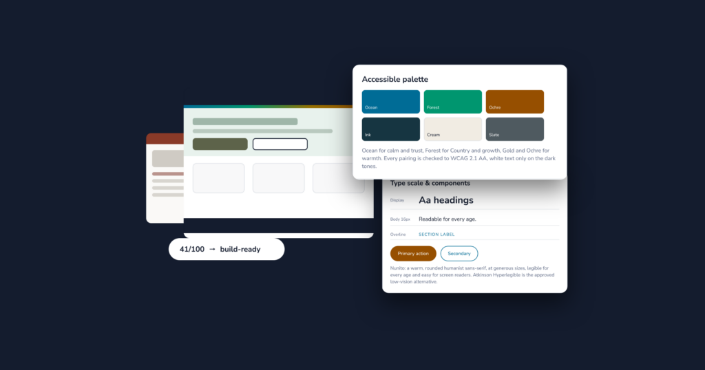
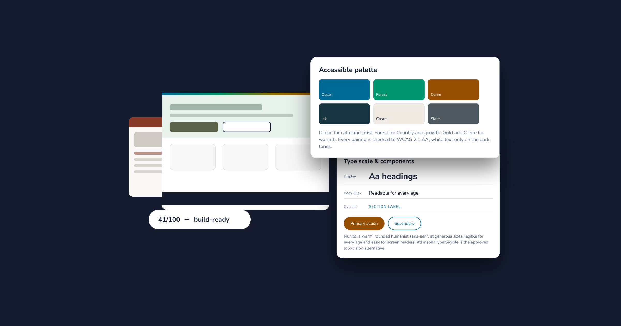
As part of the rebrand we moved to a split-complementary scheme. Ocean anchors it, with Forest, Gold and Ochre spread across the colour wheel: warm and distinctive, but balanced and easy on the eye. Every colour was chosen for what it means, and flagged for the organisation to check with community Elders.
Ocean is the primary: a steady, welcoming blue for a front door everyone can rely on. Every pairing passes WCAG 2.1 AA, and white text sits only on the darker tones. No more invisible text.
From 67 flat pages to a clear path
- 67 pages, with four to six H1s each
- A programs calendar that never loaded
- About, history, objectives, staff, committee and more, all at one level
- Donations by cheque or printed form
- About us
- Programs and what’s on
- Get support
- Get involved
- Contact
Five clear sections, a working what’s on, and a home for every task.
Two jobs, two clear paths
We mapped the shortest route for each job, then designed the pages to carry it.
Find what’s on
Take action
Every page ends with the obvious next step. No dead ends, no hunting.
The home page, rebuilt around the brief
A coloured navigation bar
So the white logo and links read clearly.
Cultural notices kept
The deceased-persons notice and the Acknowledgement, now with room to breathe.
A hero that says who they are
With two clear actions: “Find a program” and “Get involved”.
This week’s programs
A working what’s on that replaces the broken calendar.
16px body text
And AA contrast on every block.
A useful footer
Real address, hours and phone, plus an online donate option.
An accessible design system, documented
The type is Nunito, a warm, rounded humanist sans-serif, set at generous sizes so it’s legible for every age and easy for screen readers. Atkinson Hyperlegible is the approved low-vision alternative.
The principles behind it are simple:
- Accessibility first. AA contrast, 44px tap targets, visible focus and plain English, for Elders and everyone else.
- Clear hierarchy. One message and one obvious next step on every page.
- Contour bias. Rounded corners and line ends feel warm and safe, so buttons, cards and lines are rounded.
- Rhythm and whitespace. An 8pt grid and generous space keep pages calm and easy to scan.
- Consistency. One type system, one icon set and reusable components on every page.
All of it lives in a 15-section style guide, alongside a brand voice guide and a library of more than 60 icons, characters and scenes. Keeping a system like this consistent after handover is what our Design Care add-on is for.
What changed
| Before | After |
|---|---|
| 12px body text | 16px body text |
| No call to action on the home page | Two clear home page actions |
| Accessibility score of 30/100 | A system designed to WCAG 2.1 AA |
| A calendar that never loaded | A clear, working what’s on |
| 67 flat pages | 50+ responsive pages in five sections |
| No documented brand | 15-section style guide, brand voice guide, 60+ icons |

Grace Quach
UX/UI Design and Marketing, Zetta
I’m the designer behind Zetta’s Design & Web add-ons. Site audits, brand work, websites and your monthly Design Care hours all come to me, and I do the work in-house at our Perth office. Start with an audit, or give me a call and tell me what you’re working on.
Connect with Grace on LinkedIn →Related reading
- Building Zetta Essentials: a managed IT brand for Perth small business
- Zetta launches its Reflect Reconciliation Action Plan
- What the Essentials Site Audit covers
Want work like this? Start with a site audit.
We’ll review your website for usability, accessibility, performance and search, then show you what to fix first. It’s where this project started.
Request your free audit